PROGRAM LEARNING OUTCOME:
Solving Problems
NAFSHI INC.
Problem Solving
Problem solving for this client is something common with branding, like creating assets which instantly engage a call to action; this will be demonstrated in this narrative, the project: Greener Day Toys & Books. The solution is, creating a logo for Greener Day toys & books. The Problem can be solved by creating a memorable and emotional logo that gives the brand a hierarchy value, for the clientele and the target audience.The name of the client is Greener Day Toys & Books. They are an eco-friendly toy company, that caters to children between the ages of two, and six years of age. Their target audience college age parents, grandparents, and minimalists people too. Offering a comprehensive, alternative, to educational learning. This logo will show that it will stimulate the target audience, while being proactive in the earth, and the children. The concepts chosen are for emotional value, educational purposes, and to enlighten, the target audience. Plus, the wooden blocks create tactile, and cognition in the child at an early age and a longer playing time; For the case, Greener Day Toys objective is to make toys safe for children, and safe for the earth. Having a unique logo will, first and foremost, help the brand stand out more clearly, and effectively than those that use a boring stock logo, one that’s difficult to decipher or no logo at all leaving the client with a cliche logo that is not memorable.



Logo Choice
Picking the logo for your product not only set apart the brand and as hierarchy; it also creates memory value for client and the target audience. The logo created the uniqueness and sends the audience in the direction of the brand, and gives you a reason to explore, and read the narrative of the brand to be able to make the target audience purchase the brand.”. The brand from the designer perspective has to do with the physiographic of the target audience to know how to emotionally create the logo to pull the target audience in and create purchasing value.
what distinguishes a brand it sets it apart is realized via the brand personality is established through the design. By an array of elements that all operate cohesively together to create a distinguishing depiction in our hearts. Reliant on the company’s value, based on its character. Which can include the assets uniforms, which can include all of the above vehicle graphics, business cards, product packaging, photographic style, coffee mugs, billboard advertising, and a raft of other items, including typography choices on their website. ”When we look at something, we don’t read first. Before anything else we see shape, we see colour, and if that’s enough to hold our attention, then we’ll read” (David Airey)
The logos that was designed for target Greener Day Toys target audience it will make them imbued with emotions from the logo to the brand, the concept in the design of the logo is to create emotional value in the target audience. In hindsight the panda logo that was chosen in the end, for this client, it expressed all the qualities of the brands identity, which
reinforces the type of brand quality that we the designer must express making the brand differentiation to the audience’s needs. This logo is a direct correlation to the brand Greener Day Toys. While empowering you to being more conscientious adding emotional and memorable value plus, the black and white of the panda stimulates the mind. In this way of thinking through emotional and memory values will make the brand set apart creating distinction of hierarchy and differentiation. The Red Pandas are becoming extinct, and it will stir emotions making the target audience proactive and they will want to get more involved, and bamboo is sustainable, the pandas eat the bamboo which will not impact the environment. So, using this to represent the brand will ensure to be of a hierarchy. Because of a high conscious thinking, the logo concepts when making this decision is to keep the logo identifiable for the deaf and the hard of hearing and to play on emotions, while Greener Day Toys create toys and books that are sustainable making it safe for the children, and the animals such as the panda along with bamboo logo which will represent the brands logo. When seeing the panda bear this will make people have extra conscious and memorable and emotional effect about the brand. According to the article Brand Archetype, (2019) J. Cass, explains it this way and says, “Whether you are reluctant to use products other than Apple’s or you simply cannot buy tissues from anyone, but Kleenex, your feeling towards basic brands is interconnected to human psychology. Archetypes instill humanity into your mission, vision, and values. They paint a picture of the universal expression of behavior and communication and enable you to set apart your brand from the competition (p.10).”


Designer Eye
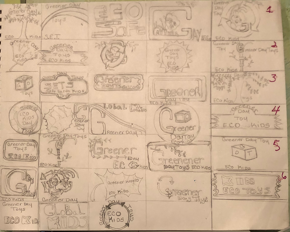
The logo that was chosen for Greener Day Toys was a careful thought- out- process. Which had to be done through an emotional, and memorable value; through the physiographic of the target audience. In Greener day’s case, their target audience are minimalist, younger college age parents, and young grandparents. This was the first direction the logo was going in the beginning, not realizing that this was the very first time the professor told us we had to create a logo. So, it was very scary, trying to gain perspective, on understanding on how the logo is to be created. It must have the name of the company in the logo, or the symbol must represent the name of the company Greener Day Toys. However, these logos that we had to create and sketch, starting with these couple of logos was only the beginning. All the other students were sketching theirs all fancy, like, in adobe illustrator; at first it really got to me but then, suddenly, a giant realization hit me! I am a great artist whom, not only, studied under a great artist and professor of mine in undergrad program, but having studied under the great iconic masters. Artists such as: Jean-Michel Basquiat, Keith Haring, Andy Warhol, Betsey Johnson, Kenny Scharf. Which we still talk with each other to this very day, for those of them who has not passed away.
This is when it turned around and the creative juices started just flowing, researching on pandas and to draw a few preliminary sketches of the panda, and that is when It was realized, that anyone can just do a quick scale of a panda. That panda was drawn, so much It could be done blindfold. Eco Kids, Eco educational kids, Eco Ed. Kids, which was all in the process of developing stages. The logo of the panda and green G, drawn into a bamboo shape was the original sketch but red was decided at the very last part of vectoring this logo with Don Larson. It was also based on a call to action so, the grandparents will see the logo and take notice for the sake of their children, and the benefits which include cognition and tactile skills from the toys. Remember it is a natural, organic, and sustainable, as, well as educational toy products.


Colour Palette
The colour choice was the primary colours and its complementary colours. These are all the encompassing factor that creates an inclusive, and exclusivity in the brand. The logo has the use of black and white to stimulate the audience both the children, parents, and the younger grandparents. The logos at that time it seemed like it was great idea but then when meeting with Professor Larson he said they were a cliché; So, it was back to the drawing board. According to (A. Gesch) Logos are one of the highest and vital components, of constructing the main assets for the brand. It is a major benefactor of branding development, that is all promising, more than likely the clients will take notice. The logo feeds the client with pertinent information on the business, so the target audience will relate to the product that is being branded it's obvious, the client shall be enthusiastic to take - action and spend their money and invest into the brand.
One of the ways to contemplate designing a logo, is to think of the target audience that WILL encourage living your best life, which in return you can cultivate a logo that is based poignant worth, and memory. If there is someone who inspires your life more than likely you can visualize them in your mind. Along with the perspective of the brand, the logo is like the mascot of the brand, just so, the client can connect, and interact, in return it will spark a feeling to purchase, through service of a company; by way of products the client can easily remember through the logo. Anytime they see the logo they will associate the product with the company.
Educational
Greener Day Toys offer benefits of educational value and create tactile skills and cognition in the children. Plus, longer playing time. Children will experience a natural progression with Greener Day Toys in growing cognitions.The tagline is Greener Day Toys is Safe for the earth and safe for the children.These all are pertinent to the only- ness - statement which is telling of the emotional, and memorable values and its benefits, to creating this logo which differentiated the brand. The logo will add to the grand look and feel and complete and make the brand a hierarchy. According to (D. Mayer (2011). They’re prevalence develop a shared trepidation to which designers often see their clients, in which the customer deemed the design extinguished only to reach a point in result of both parties’ the client disregard developing a message that will remain memorable, bringing up insight for a long-time along and forming an alliance with the client.
The design decision that was carefully the clear choice made for the client to set Greener Day toys brand apart. “(At least that was what was thought at the time)”. Giving the brand a distinction and a hierarchy, was the very reason the design decision was made, based on the target audience. Along with all the other elements such as texture, which is the gray paneling that the opacity was lightened for the background, for minimalists. The geometric shaped elements used in the artwork is to educate and create culture in the children at an early age. The circles were created as the bullseye affect to stimulate cognition and tactile skills. Also to allow the target audience to see the brand as a target too. Which will strike an emotional value to the psychographics. The lines are used for separating of the elements in the artwork offering playfulness.


The Goal
This was the goal that was set out to be achieved. The sketches were about 111 sketches to end up with the panda with the bamboo G in red. Needless to tell you “How sick it made me. Having rendered the amount sketches and all the rewriting Dr. Baldowski had me do over, and over repeatedly. Plus, the constant refining of the assets that Kratz had me complete and refined. The hard work that was put into this brand put me in the hospital for the holidays.” Sometimes when you have professors that have high degrees such as Dr. Baldowski, sometimes they take the Long Way home in explaining what they are trying to get you to deliver. Decidedly, going to Professor Don Larson and asked to explain it simpler, he did and showed exactly what was needed. Instantaneously It all made sense and became a relief; it was like a giant break through a simpler way finally. Now the creative juices started to flow. That which was explained in a long roundabout way, suddenly became so much easier to deliver at that point. A person does not mind working hard, what is bad though, is working and not understanding what it is that is being conveyed. The professors all need to find a better way explaining what is supposed to be delivered. Additionally, the blog Logo design:15 golden rules for crafting logos also states that “ Logo design requires a lot of knowledge, skill and experience. There are many elements to consider, and the questions you need to ask yourself can become overwhelming when you're new to the trade. If you're creating a new logo design from scratch, you need to think about how you'll represent the brand, product, or individual's character” (N. Carson, D. Aireys), (par 1). This was how it felt at first then it got easier and everything just flowed.
Development
The concept that the toys are sustainable, and educational; will make the children smart and safe because children are like sponges, if you rear them correctly, they will think intelligently, and the grandparents will be even smarter; they will be wise for purchasing toxic free toys for their grandchildren. Greener Day Toys allow the grandparents to play and teach with these toys; that are toxic free and sustainable. While developing at a higher rate of cognitive growth pace than the norm. These are the other logo choices of the wrong direction before coming up with the genius logo that was designed by Nafshi inc. This was an acronym logo, Called S.E.T.S., which stands for, Safe Eco toys or safe earth toys for the kids..
This came to be a part development process through thoughtful consideration which turned out to be cliché and all the logos was not memorable. They did not add value to the product and did not evoke memory. Concepts of the panda logo came about because of Greener Day toys being sustainable and the extinction of pandas at one time however, they're no longer endangered after doing careful research. It has always been a favorite animal to everyone because they’re goofy especially when eating bamboo. when a baby panda plays, he plays upside down on the bamboo, or when the female panda is in heat, she is very playful, and she will turn herself upside down on the bamboo. This is how the male panda knows she is in heat. Which attracts the mail to the female to procreate with the panda. This is the story behind, the panda and the design decision that created the logo that turned out brilliant. There is a profound love for panda’s worldwide, they are loving, and tender animals. The pandas are a widely favored animals so, this is what spurred the thought of a baby panda eating bamboo upside down to represent the children’s toy company. This is how ideas morphed into this brilliant logo, and there is plenty more creative ideas where that came from.


Two Brands
For instance, Professor Argo told the class to work on both brands, because there was another fantastic logo design for the Las Vegas Enforcers as well. This logo designed for Greener Day Toys was a stamp of approval for the client and target audiences’ memorability. Then came the tag lines. Because we are feeding the pandas it will be saving the earth by growing more bamboo sustainable material. This was a win-win idea. Then came the ingenious idea into turning G red for the bamboo. The logo sketch variations were sent to professor Larson, and he vector the design that Nafshi Inc., created in adobe Illustrator. He kept the G green, and he showed, and taught me how to vector my sketch also. Then what was said at the last minute “let’s not do Green for the G it’s too cliché, and Professor Larson said what do you think it should be? It then occurred to me and said, “let’s do it in red for call to action”. Eureka paydirt was hit and a star was born. It was the logo design of the century. A brilliant star logo, and it was a great idea for a logo; “as they say two heads are better than one”. In addition, Greener Day Toys & Books is eco-friendly enriching as well as enhancing the children and the world.
The toys being safe and sustainable, creates a safetynet for the children; this was the devising process and ideas behind the rationale. The solution that was derived through concepts of the toys being safe non toxic for the earth and the children. So, this was applied to the logo conceptual ideas, from the only-ness- statement. The motto is to make the audience feel the world is safer with Greener Day wooden toys & books. Which it came to the next chosen notion for tag lines such as, Greener Day Toys is safe for the Earth, and safe for the children, Greener Day Toys, are natural wooden toys so, children can play safely while bringing education and joy.to families lives. The other concept is bring the world together and safely with greener day toys. According to Paul Rand,“ Most clients are not aware that the media designer brings a lot of emotional values to their products.” (P. Rand, 1991). This will bring awareness to everyone.
Design Vs Art
Furthermore, the logo design is not art, too many people mistake them for art since logos are a visual object. Our role as designers is not to design a thing of beauty. Do not to design something we or the clients personally like the look of, but instead logo design needs to be treated as a strategic business tool that will allow a company to be identified in the vast world, we live in. Of course, a logo can still look good, but that should be a secondary factor when designing a logo identification comes first. In addition, Szostek,(2018) stated in UX design blog, building emotional engagement: stated “Building an offering and service based on people’s deep needs offers an untapped yet space for growing your business. Think of it — who doesn’t want to feel good about themselves after an interaction with a bank, a travel agent, or a shopping assistant? Role enhancement and role transition are two main directions that can be a choice in this process. But there are other elements that elevate the emotional engagement effect in humans (para 15)”.The use of adding eco kids to the logo for greener day toys will instill and reinforce an emotional value for the brand making it of a hierarchy. By directing them that, this expresses a high value product made exclusively for their children. This will create a higher level of thinking and a better earth for the future of the young children and animals. Being persuasive to the client by showing them that this logo will strike an emotional chord in the target audience, leaving a lasting memory, and impression on their minds and heart. Eco kids will make a great extension to the brand for the future, also the panda is called eco panda.


Fresh Approach
To keep the brand fresh, it must constantly extend the brand by creating new labels under it or to refresh the brand by giving it a facelift or upgrade. Here is a great example: If you own a nightclub every two years the owner should rename the nightclub a different name to get their following up, to keep more clientele base coming to your establishment to constantly keep it fresh. The club will keep the following growing, and it will be reported as a new club opening. This means a new name creates new swag; this is a known fact with nightclubs. Nightclubs every two years they change the name to bring in new clientele. To keep the business in the loop, refreshing the brand. This should be the same approach taken for branding any business. In other words, it would be a brand refresh, or a new brand all together leading the owner to create a new logo assets which is a healthy approach to rebranding.
The visual on the logo from the drawing sketches to vectoring and the other ideas before it became the logo it is now According to Tailor Brands, (n.d.) Logos are a point of identification; they are the symbols that customers use to recognize your brand. A good unique logo will trigger a positive recall about a brand that the name of the company alone may not. This logo feels like it could really represent any company that wants to identify as eco-friendly. The other logo options represent more than the eco-friendly aspect of Greener Day Toys. Here’s the visual on the logo from the sketches to vectoring and the other ideas before it became the logo it is now “the red panda became the reason for using a panda as a logo for Greener Day Toys. This was to demonstrate problem solving through assets and in a sense being the archetypes, will engage the target audience for a call to action through emotional memory.
Conclusion
So, to conclude, the design solution is to create a long lasting memorable, and emotional values to the logo showing a brand of a hierarchy. To the estimation of Eco kids, it can be an extension to the brand greener day toys; it turns out that everything that you think of during the brand, and the process of creating for the brand can all turn into solutions and possible new ideas for upgrading the brand. All the ideas can all be used and be inclusive to the brand. Echo kids can be an extension to the brand and create children’s clothes from it. A whole children’s line can formulate to create Eco kids using the same Logo so everyone will know that it’s Greener Day Toys. A nice ending to a story in branding for 2022. This is a mock client and if it were to be a real client this is what the design solutions would be for this client. Because in branding you always should know the end before the beginning. When referencing the article written by Carson and Christie (2021) “Circles, ovals and ellipses tend to project a positive emotional message. Using a circle in a logo can suggest community, friendship, love, relationships, and unity"(par.6) .

Citations
D. Mayer, (Feb 21, 2011) Examining the Design Process: Clichés and Idea Generations. Retrieved from: Smashing magazine blog.
B. Miggs (1991) Interview with graphic designer, Paul Rand-Part 1 of 3; retrieved from: YouTube.
A, Gesch. (2019), How to Design logo; The ultimate guide: retrieved from 99design/bloghttps://99designs.com/blog/logo-branding/how-to-design-logo/#whatnotto
N. Carson, D. Airey, (Sept. 09,201), Logo design: 15 golden rules for crafting logos; retrieved from: creative Blog.https://www.creativebloq.com/graphic-design/pro-guide-logo-design-21221
O. Avraham ( Jan. 3, 2021), Designing a logo for your brand Step by step tutorial. Retrieved from: Elementor Blog.
J. Cass, (Dec. 18, 2019): Brand Archetypes – Ultimate Guide with Examples retrieved: Justcreative.com
https://justcreative.com/brand-archetypes-ultimate-guide
A, Szostek, (June 26, 2018): How to design solutions the people become to love. Retrieved from: UX Design.
https://uxdesign.cc/how-to-design-solutions-that-people-become-to-love-7fdf12a9248b
Tailor Brands. 7 Reasons Why a Logo is important. Tailor Brands.
https://www.tailorbrands.com/logo-maker/why-a-logo-is-important
Carson & Christie. (August 9, 2021). How to craft a powerful logo shape. Creative BLOQ. https://www.creativebloq.com/logo-design/psychology-logo-shapes-8133918
A. Shah (2022) The Red Pandas, Climate change, and the to save the forests; retrieved from World Wildlife Organization.
https://www.worldwildlife.org/species/red-panda
H. Braam (October 29, 2021) Red color Psychology, Symbolism and Meaning; retrieved from: Color Psychology.