PROGRAM LEARNING OUTCOME:
Collaboration
NAFSHI INC.
The Beginning Stages
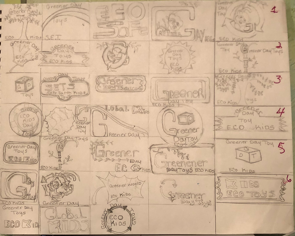
This was Dr, Bladowski’s feedback on the revision sketches for the logo which was the beginning stages of the branding of Greener Day Toys this was their feedback analysis. To evaluate looking at all design work that is in keeping with the elements choices and speaking about that in the strength the weaknesses and potential usages overall, we need more of that evaluative language add throughout. He said there are different reasons which can be good if the messaging is not reliant on color, but color could hurt how it comes across. So, looking at your narrowing down one thing that's missing just right out of the gate is that you're not showing the progression of enough of the refined variation sketches, so, it can be vectored; so, we need to see the initial first step to get to initial first draft, then five refinements. He suggested to please resubmit your work in this format showing a clear progression of ideas from the sketch’s revision draft. The progression concept should take the initial sketch and present different versions to show how you've arrived at each of the revision drafts. The second area that needs to be adjusted is the name of the brand. I cannot let this move forward with an incorrect brand name. Please make sure, as mentioned previously, to keep the brand name consistent as greener day toys. I have not been told a name change has been authorized.
My goal is to help you move forward with the final logo evaluation, also from Doctor Baldowski and their feedback was mostly needed because it was the final stages of refining the sketches. It was imperative that this was understood of what was needed moving forward. On the other hand, self-evaluation and assessment as well, as vectoring the logo before the design process could go any further. I said it is best to wait for Professor Larson’s feedback first before moving forward, please I said the schedule is very hectic because of all the work that was on all of us this must be done. So, this was, what was, asked of Dr. Baldowski. When professor Larson gets back to me about the work then the adjustments can be made with the name, Dr. Baldowski said the name brand needs to be Greener Day Toys, the brand is not something else, those other names or titles you're using can be for taglines, with the name it has to be Greener Day Toys. The final logo evaluation was also from Dr. Baldowski and their feedback moving forward was most needed. On the other hand, self-assessment had to be done and self-evaluation also vectoring the logo before the design process could go any further, having only used Adobe illustrator in my bachelor program for an introduction class for digital art and was not experience enough to vector this logo. So, Professor Larson enlisted his self and wanted to meet with me to teach me how to vector in Adobe illustrator.
The media assets evaluation and feedback from Professor Kratz was expressed like this: the three required parts of this assignment were completed and submitted on time. The next six media assets were initiated in draft submitted each of the next stages of the thesis and the assets have been seen and posted. The project media assets follow the new art style plan to give the brand its own differentiated look with a specific art piece in common. As reviewed in the live sessions, the media drafts showed some very clever applications. Some cross swag pieces needed to be removed to Nafshi inc. own brand rather than mixed in with Greener Day Toys brand the stationary package group was updated with the art style applied.



Swag Feedback Professor Larson/Kratz
Reflecting on the entire process, reflecting on the time(s) having met Professor Larson, and collaborate on ideas for instance, the swag for the mock company Greener Day, having no clue on how to vector and produce the assets. At this junction Professor Larson suggested, “can you paint abstract art for the brand, we want to put the logo on your artwork.” The creative lightbulb went off and a seemingly surefire Media Marketing move. When we took the meeting the first thing he said was “I have an idea that could help foster the assets you want to create because you cannot just put the logo on everything” the logo is not the brand its purpose is represented as the brand identity and to remain a memorable brand in the target audience. So, he starts typing on the computer to pull up this website and then he begins to put the artwork into the website.
He shows the assets (or swag), and the completion of the brand was completed, everything came together in a perfect marriage. how the artwork looked on cups, clothes, letterheads, billboards, and flyers. It was the perfect union to the branding of this logo. He branded the asset and feedback from professor Kratz was said best like this “your project is moving forward Nafshi! Remember that examination and adjusting of the brand asset works, and the accompanying evolution of design thinking, is just a natural part of the ongoing design process. As you said, smarter, not harder! Keep making progress and solid advances to consolidate your Greener Day Toys Brand and finish it strong!” This was the goal in mind.
Self Evaluation
Self-evaluation of vectoring the logo and creating the assets were the two hardest parts of designing this brand. Looking back at the self-evaluation process every portion of the assets it was checked off need’s improvement. The reason the decision of needing the improvement was made because this was the first time designing a brand - vision playbook, this needed to be corrected until it was interconnected. Cohesion is the key to doing a brand playbook, this is what gets the client emotionally connected to the logo and the assets; it creates an emotional value based on brand archetypes. It was Professor Kratz who told me the very first video logo that was created, the video in question being the panda's arms flailing gave it the appearance of insanity. The realization came like a “star in the night” so to speak, as Media Design is much like a science in it must be proven through careful research, graduating from a hypothesis into an invention. In the pursuit of continued collaboration, Professor Kratz, being the art director, offered guidance in such a way to bring inspiration. Professor Kratz’ observation regarding arms in the logo animation (Art Direction section). feedback and self-evaluation


Brand Vision Playbook
The brand playbook self-evaluation There was research achieved on brands that used art as ad space and there was not a lot out there. What was discovered was there really wasn’t any at all. The art gives a childlike representation with one-of-a-kind art by Nafshi Inc. inspired by CY Twombly, Jasper Johns, and Keith Haring. Keith was someone that was personally known a friendship that stemmed through the years; he used colors and black strokes to create a language of its own that related to children, like coloring books. Brand voice and tone needed improvement, and the look and feel met and exceeded the example because of the art element of the geometric shapes. The art itself will teach your children to be well cultured creating a higher visual hierarchy which meets and exceeds normal examples of media designs. The same as the color and the contrast as well as alignment. Repetition proximity and negative space all met the requirements. There was a little texture for background target audience which are minimalists. To be frank this was the first time doing this, so everything needed to be improved. Putting the brand together was very tedious, and difficult because you’re trying to please two people the client and the target audience, this is not personal. Everything was based on the psychographics. Do you know this was the first time putting this together there were needs that was not met as of yet it was a work in progress.However, the brand needed to be cohesive this was what the brand needed to bring it to a high valued standards.
Professor Larson and The Art Asset
Professor Larson’s suggestion to use abstract painting style, feedback and self-evaluation Collaboration begin with professor Larson first and foremost, He emailed me and said Nafshi I would like to set a zoom meeting with you about your design ideas with the sketch’s that Professor Bladowski made you make variations of so, I think I found one that could really work and he said Nafshi why didn’t you just look up bamboo fonts professor saying to me. Professor it never really occurred to do this because this was the first time learning to build a brand. Then Larson pulled up the bamboo fonts and there was the design concept starting to reveal itself before our eyes. Next, he used the ellipse tool and made a circle for the panda’s head, and he made six more circles to create the arms, eyes, and body of the panda. Leaving an extra circle for the outlining of the panda it is a faint circle encompassing the outer edge of the panda. Following that the bamboo G was green and such an expected cliche, what was said to Professor Larson at this point there's just one more thing and he said what's that, the green in the bamboo G should not be green it's expected and a cliche, so he said what color do you think it should be and I said red. and he said, oh an Asian flair and I said no a call to action, and abit of whimsical for the children. The professor Larson said good idea Nafshi and it gives it that look of completion. Then saying to the professor this will have a memorable impact on the target audience with a feel of nostalgia creating emotional value. Ra logo rendering logo of high value to the clients and kids.
Collaboration between a designer and a client can be considered one of its many forms. For a person to collaborate, it is best to starts with researching, and collecting data on your competition to initiate a design war against the competitors. Collaboration can also be about critique and evaluating your work as you continue to have a better understanding of what the brand needs are, what can be eliminated from it, what can be refined and the qualities such refinement will illuminate. When you conduct research, you’re borrowing ideas that were already used. With the collaboration of efforts, and the as mentioned data that was researched, comes the birth of a great design for the client. As my good friend Keith Haring said, “I like the idea of things lasting longer than you and it out living and representing you long after you have expired", this goes for any design solutions it should be a classic not short-lived. But everlasting and outlasting all great designers have left legacies.


Eco Friendly Toys
The eco-friendly, sustainable wooden block toys help to represent the brand, and it is shown that the elements in the artwork are represented through the geometric shapes imitating a nostalgic and imaginative feel of a child like painting, while developing cultural intelligence. The logo’s designed purpose is to provoke feelings that are unforgettable, remaining within the clients and target audience’s heart(s). The art shows an imaginary abstract wooden toy car, and the toy blocks being just as playful and imaginative as the artwork itself. Each design decision is to represent stimulation and creativity in the mind; it also helps to spark imagination while keeping within the brands image and setting it apart. According to kidshealth.org, Mary Gavin (2021), stated that “Imaginative play begins in a child’s mind. But that doesn’t mean parents can’t join in. When the children leap through the air and they are flying, do not tell them they’re only jumping. Instead, feed the fantasy.” Choose sustainable wooden block toys. Greener Day wooden block Toys & Books are toys that require creativity and therefore spur imagination.
With all, this being said, the theme of innocence in the artwork and logo correlates with the brand and is an ingenious usage of all its correlating parts. Introducing creativity and imagination to a young child would be beneficial for the parents, grandparents, and minimalists to see the child’s growth and make note of it, which in return will allow their creativity to broaden as they grow. Pursuant to the article 10 reasons why creativity is important Soken-Huberty (2020), says “Freedom of expression is considered so important to person’s well-being that it’s a human right. Creativity is the key to the door of expression, no matter what form of creativity you choose. It could be painting, sculpture, music, cooking, or anything else that brings interesting and/or beautiful things into the world.” This is a fact look how innocent the logo is fostering loyalty in the consumer's hearts for a long memorable feeling of nostalgia. Now when they view Eco panda they will say, Aww how cute he /she is, it is so adorable for my children, it should ignite a selling point.
Thought Out Plan of Action
The logo that was chosen for Greener Day Toys was a well thought out and methodical plan of action. Implementing the idea, which had to be completed through emotional, and memorable value through the physiography of the target audience. The emotional, and memorable values add to its features, creating a feeling of intrinsic good and wholesome benefits, having established the differentiation in the brand, with saying that, two heads are truly better than one. What was acquired at this point was to first experience vectoring from a master, Professor Larson was showing all his great work he did with Keith Haring and then he showed the school books he use to create it was a social studies book he had to make from cover to cover, he then showed me all the different fonts to use for different types of ads, from the school books to different handmade brochures that he created because back then there was no Adobe illustrator, or Adobe in design it was truly enlightening a lot was learned and his advice was to go and play around with the logo try to take it apart and put it back together and that was what was done to become familiar using illustrator. it was also obvious this is where the concept of creating a one of a kind artwork for ad space, this was truly a collaboration of his past way of learning how to put to put ads together without the use of adobe, you see as mentioned before he never used adobe back in his day so, this is how he arrived to the artwork for ad space he said just to ad a bit of a human touch and not so digital.


Video Logo
The logo will add a sense of authenticity to the brand and completed the look and feel and making the brand a hierarchy. This article expresses “Their prevalence arises from the shared nervousness with which designers often view their clients through design: satisfied merely to get the point across in an obvious manner, both sides neglect to create a message that will live in a viewer’s memory and foster long-term recognition and loyalty.” (D. Mayer (2011). Professor Kratz suggestion to add the blinking eyes to the logo animation was feedback but many great things take time, “Be patient with yourself Nafshi” as wisely said by Professor Argo. Professor Larson talked about tweaking the video logo because Professor Kratz suggested giving the panda’s eye’s the ability to open and shut. However, it was in the discussion when we talked with Professor Larson about teaching us all how to make the eyes open and shut, he said that we would get together in February and he would show me how to do that as well as making the brand vision playbook open and closed through animation. Because class tried to complete that task and we did not figure it out. So, it must be put on hold until further notice.
Changes
Don Larson’s Professor Kratz’ suggestion to add blinking eyes to the logo animation (Logo section). feedback and self-evaluation Professor Kratz who told me the very first video logo that was created, the video in question being the panda's arms flailing gave it the appearance of insanity. The realization came like a “star in the night” so to speak, as Media Design is much like a science in it must be proven through careful research, graduating from a hypothesis into an invention. In the pursuit of continued collaboration, Professor Kratz, being the art director, offered guidance in such a way to bring inspiration. It was professor Kratz who suggested I add more elements to my artwork when I spoke with Professor Larson about it, he and I agreed that art should be left alone and never mess with it. So, the decision was made to keep the artwork the way it was and not change it or add anything to it.
One must have the eye of a designer and what constitutes such abilities is experiences likened to Patricia Field being the 1st+ sized model in the fashion world and appearing on the runway back in the 80s, having a center ad in Detail Magazine, and creating a jewelry ad for Vogue, and being the stylist for Vanity Fair. Having built such a repertoire, visiting the sets where she does the wardrobes for the present day shows such as “We Run the World” for HBO, and “Emily in Paris” for Netflix. She allowed me to present my artwork to be in the Miami Art Basel, Through Ms. Field my collaboration with her exists from the 80s to present day; all my experience went into this brand from a well-rounded and extensive background from a designer’s perspective designers eye, desiring to strive to be like the next Paul Rand.
With the implementation of design thinking, ideation, and logo development strategies, this project is in its final stages. Ideo (n.d.) explains that there is no single definition for design thinking. It’s an idea, strategy, a method, and a way of seeing the world (para. 8). The approach that was taken was a non-linear approach, where there were several factors that influenced the creation of the foundation for the art, logo, and all assets, voice, and tone. Stevens (2021) suggests that it’s important to remember that “Design Thinking” is not a strictly linear process (para. 5). Without going directly to creating and generating ideas, the process was entirely researched, analyzed, and appropriated. Inkbot Design (2021) explains how we use primary research, which involves qualitative research and quantitative research, to discover reasons, opinions, and motivations – it provides insight into the overall problem (para. 11).
Logo Video before feedback and refinement


Collaboration
Collaboration for Greener Day Toys, with Professor Larson and the logo, assisted in the creation of the initial stages of logo development in adobe illustrator and designs by Nafshi Inc. Which established the direction in which was necessary to development and the solutions that will reflect the brand and connect with audiences. You see, Mr. Larson has a rich background steeped in media design foundation, He is a genius hence, the term genius logo. The design problem consists of a need for the logo to entirely represent the brand, while it speaks to the brand’s value, intention, and benefits that represents its features. The approach taken, was to establish a base to work from, which consist of the creation of the look, and feel, which also, consists of the elements, and the assets that work well together and speak to the tone of voice, and features/ benefits of the brand to its entirety. Collaboration is also considered a self-evaluation of the brand when it was being completed. Assessing the critique of the brand was thought to be very enlightening, and thought-provoking along with awareness. One, just cannot lie to yourself about what you’re lacking, especially after you were critiqued by your professor prior to completing the assets for the brand. So, there develops an inner knowledge, or a third eye perspective, i.e., intuition of exactly what you had tasks to complete each week until its final stages, so it was a realization moment. this came with a great epiphany instantly.
Conclusion
To briefly recap and conclude, creating a design solution sometimes requires you to evaluate, and collaborate on your ideas with yourself, and or, others to critique the work, but most importantly, collaboration through reflection, and research and harsh realities sometimes. It is a very important also crucial point to completing the design solutions, however, sometimes working with others through collaboration, communication will help to resolve any design issues and find solutions. In this case it is Greener Day Toys and each of these designs decisions all represents the eco-friendly aspect of Greener Day Toys which name is derived from. According to Holzer (2018), the term eco-friendly refers to products that contribute to green living or practices that conserve resources and prevent contributions to air, water, and land pollution. Greener Day Toys wants to be known as an eco-friendly brand as well because they sustainably source their wood and their products will last longer and decompose when thrown out, not contributing to landfills. Hence the panda is representative of our ecosystem and how it is very stimulating because of its colors black and white and red, are a call to action and rendering it a hierarchy for the all the consumers.
The artwork is the asset which also is designed to communicate cognitive skill development on behalf of the children as well, as culture and this in return will fuel and inspire them, and they will also learn while delivering imagination. According to Lovevery (n.d.), wooden toys promote creative play, inspire, require hand-eye coordination, and fine motor skills, as well as support important skills for learning math like pattern matching and recognition. Greener Day Toys wants to promote the use of creativity as stated in the brand profile, the tactile use of wooden toys helps younger children with hand-eye coordination and can lead to more creativity because they are active participants in the creative process. This required three of the Program learning outcomes, which is another way of utilizing research, problem-solving, and collaboration and acquiring competency.
These are essential to creating design concepts for Greener Day Toys & Books, a sustainable company that’s eco-friendly. Although this is a mock company, it would be great if it was real so, it can offer an entry level of design for a company or a client. It was great practice and learning and experiencing in the process of creating a brand from start to finish. Logo design and the assets, art elements in marketing communications: Brand logo complexity moderates exposure effects on brand recognition and brand attitude. Self-evaluation as collaborative efforts for Greener Day Toys was very interstellar because this was a miracle creating for this mock toy company by pushing and pulling this whole brand together. While looking at the initial design elements and logo concepts, these ideas were easily obtainable because they could be deemed a different way to go about design solutions and concepts.
The ideas for this brand were supposed to give a feeling of saving the earth for future generations, but also stimulating children’s minds as well as the parents, creating a warm fuzzy feeling inside, whilst having a call to action of saving the earth. The concepts dictated the choice to use an animated logo because they really convey the purpose and qualities of Greener Day Toys effectively. It was one of the most memorable experiences that could occur in someone's lifetime. Self-evaluation gave me insights on how to be a full-on designer, enabling me to use my intuitive mind to be a majestic designer. So, the designs will never stop coming when a designer in that moment of creating and refining variations of a logo, and engaging these abilities produced 111 variations. Overall taking stock of oneself and doing introspection create a thorough and methodically well thought out Complete and cohesive brand. Another self-evaluation was learning to suffer humility, be humble and keep things simple; my main take-away is self-awareness, temper yourself expectations, and you will never cross paths with disappointment.


Citations
Gavin, M. L. (Ed.). (2021, January). The magic of play: How it inspires & AIDS early development (for parents) - nemours kidshealth. KidsHealth. Retrieved October 2, 2021, from https://kidshealth.org/en/parents/play-magic.html.
Soken- Huberty, E. (2020, April 12). 10 reasons why creativity is important. The Important Site. Retrieved October 2, 2021, retrieved from:
https://theimportantsite.com/10-reasons-why-creativity-is-important/.
D.Mayer, (Feb 21, 2011) Examining the Design Process: Clichés and Idea Generations. Retrieved from: Smashing magazine blog. Retrieved from:
Stevens, E., (2021, Aug 5th). What Is Ideation in Design Thinking? An Ideation Techniques Guide. CareerFoundry. Retrieved from: https://www.careerfoundry.com/en/blog/ux-design/what-is-ideation-in-design-thinking/
Inkbot. (2021, Jan 14th). Professional Logo Design Process from Start to Finish. Inkbot Design. Retrieved from:
https://www.inkbotdesign.com/logo-design-process/
Ideo. (n.d.). Design Thinking Defined. IdeoDesignThinking. Retrieved from:
https://www.designthinking.ideo.com
Sharma, N., & Varki, S. (2018). Active White Space (AWS) in Logo Designs: Effects on Logo Evaluations and Brand Communication. Journal of Advertising, 47(3), 270–281. Retrieved from: https://doi.org/10.1080/00913367.2018.1463880
Bo van Grinsven & Enny Das; (13 Jan 2014) Logo design in marketing communications: Brand logo complexity moderates exposure effects on brand recognition and brand attitude, Pages 256-270 | Published online. Retrieved from: https://www.tandfonline.com/doi/full/10.1080/13527266.2013.866593
Hilde A.M. Voorveld: (09 Apr 2019) Brand Communication in social media: A Research Agenda. Retrieved from: https://doi.org/10.1080/00913367.2019.1588808
Holzer, D. (December 2018). What Does Eco-Friendly Mean? SFGate. Retrieved from:
https://homeguides.sfgate.com/ecofriendly-mean-78718.html
Lovevery. (n.d.). Why wooden toys make the best playthings. Lovevery. Retrieved from:
https://lovevery.com/community/blog/child-development/why-wooden-toys-make-the-best-playthings/
D. Larson (10/21/21), The GreenerDay Toys &Books vectored logo in adobe illustrator/